


")

")
You’ve found your dream photoshoot location. You’ve chosen your session. Now comes the question that stumps almost every client: which color?
It seems simple until you’re staring at a catalog of 150 dresses and second-guessing everything. The truth is, color choice is not a matter of personal taste alone. The right shade interacts with your skin tone, your hair, your eyes, and the result in photos can be striking or flat, luminous or washed out.
This guide gives you a clear, practical framework to find the color that was genuinely made for you.
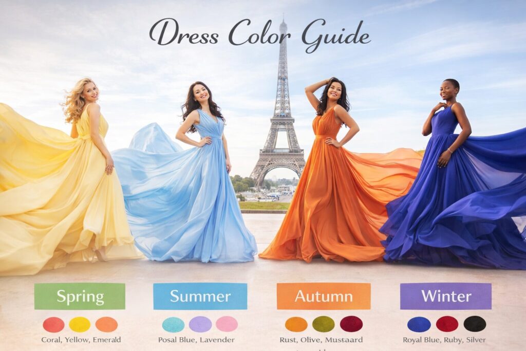
Table of Contents
The Color Season System
Here’s something most people don’t know when they’re choosing a dress: color is not just about what you like. It’s about what likes you back. ✨
The right shade will make your skin glow, your eyes pop, and your photos look effortless. The wrong one, even if it’s beautiful on the hanger, can wash you.
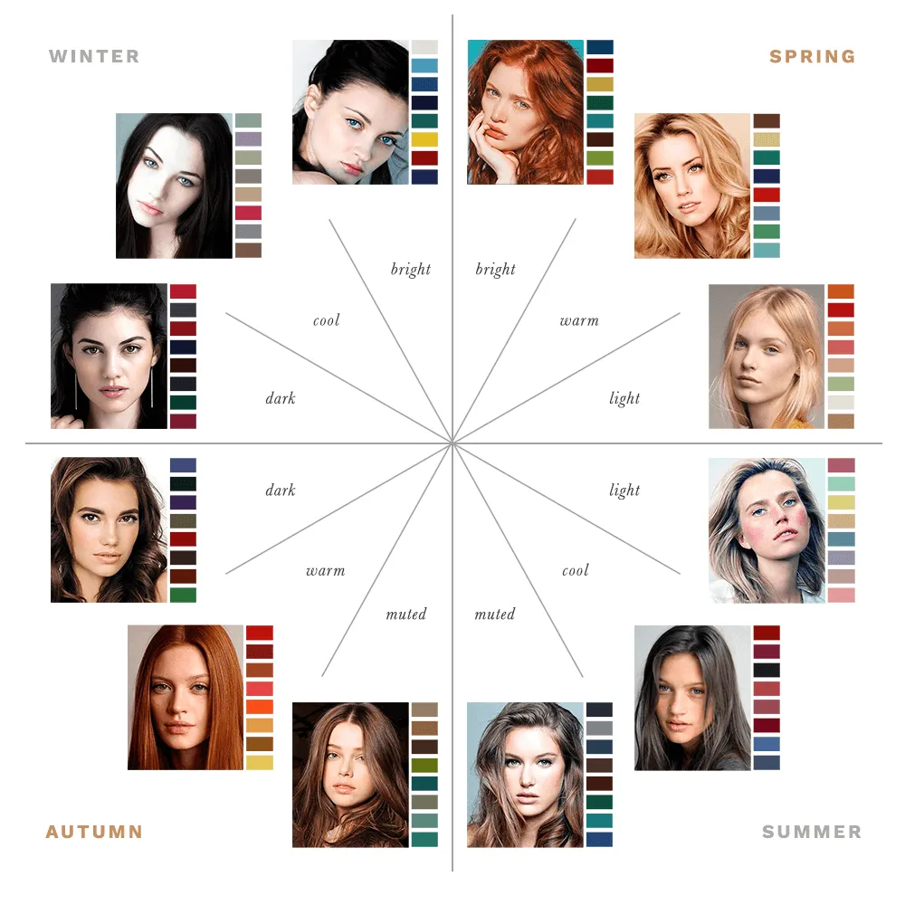
That’s where the color season system comes in. Developed in the 1980s and still one of the most trusted tools in personal styling, it’s a simple framework that groups natural coloring into four seasonal palettes: Spring, Summer, Autumn, and Winter.
Your season is determined by the combination of your skin tone, hair color, and eye color, and once you know it, choosing a dress becomes a whole lot easier.
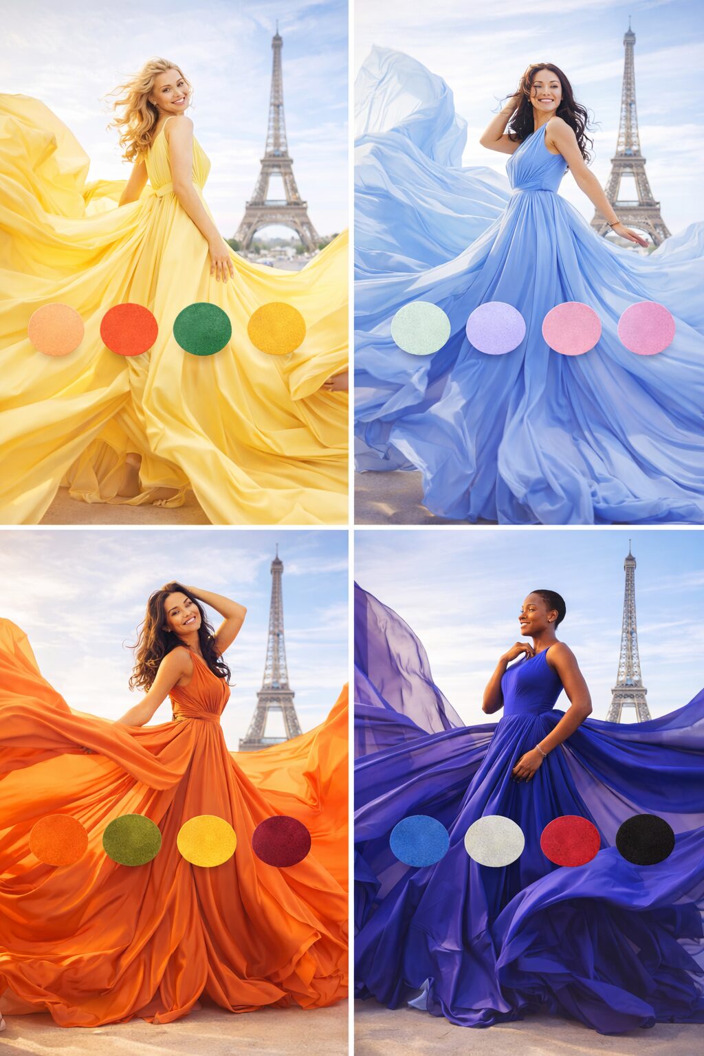
🌸 Spring
If you’re a Spring, there’s a warmth and brightness to your overall look that feels fresh and luminous.
Think golden or peachy skin, eyes with little flecks of gold or green, and hair that catches the light, whether you’re a natural blonde, a warm brunette, or somewhere in between. You might not have the most intense coloring in the room, but there’s a radiance to you that the right colors can amplify beautifully.
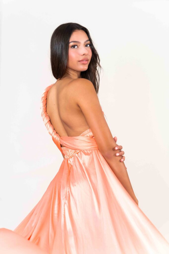
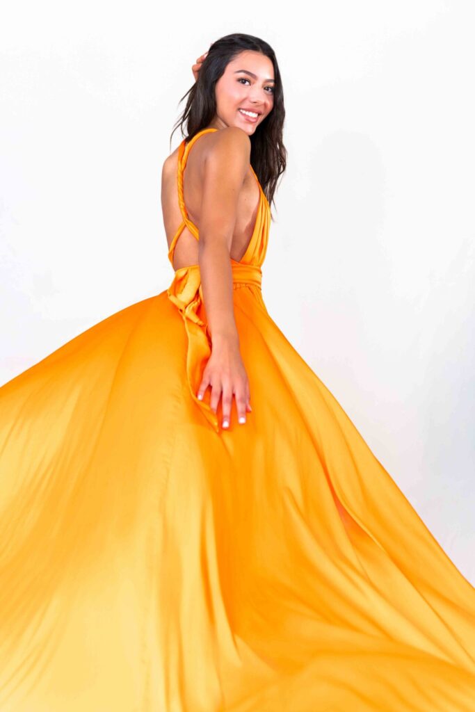
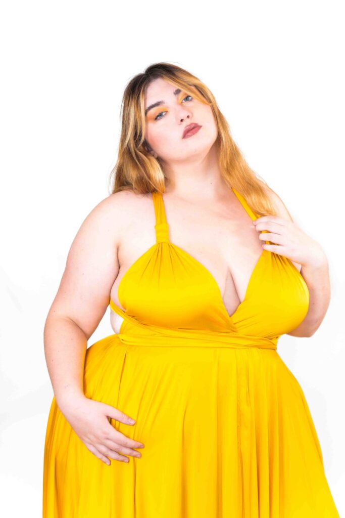
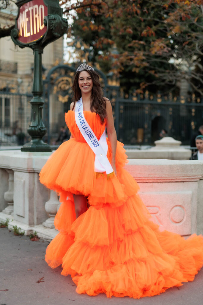
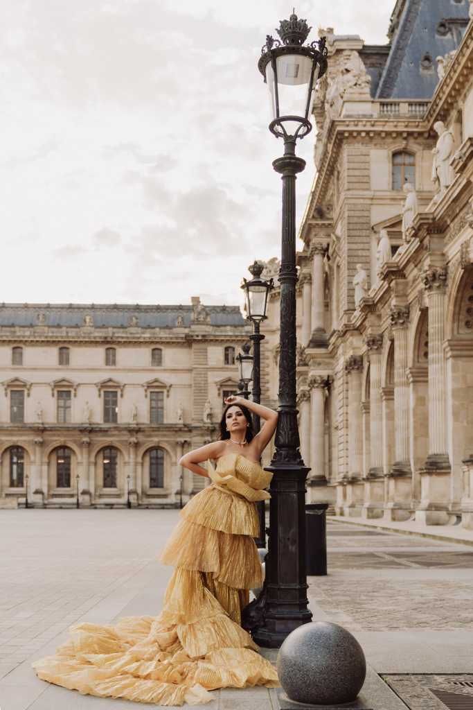
Your palette is all about warmth and clarity: coral, peach, warm ivory, golden yellow, soft turquoise, salmon. These shades echo your natural glow without overpowering it.
What to avoid? Anything too cool, too muted, or too dark, as these tend to dull your complexion rather than enhance it.
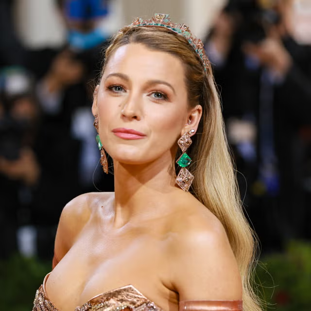
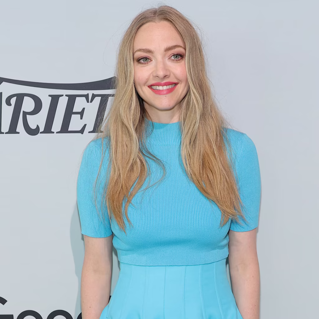
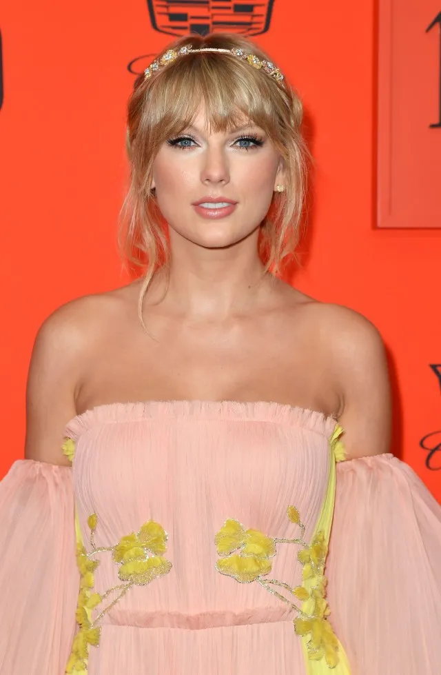
You’re in great company as a Spring. Blake Lively, Taylor Swift, and Amanda Seyfried are all classic examples of this season’s signature warmth and luminosity, and if you look at the colors they gravitate toward, the pattern becomes immediately clear.
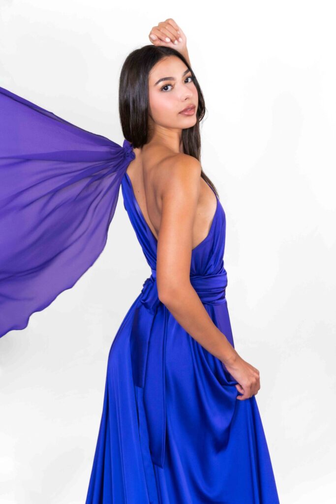
☀️ Summer
Summer is the season of soft, cool, and effortlessly elegant. If this is you, your skin has a pink, rosy, or cool beige undertone, your hair leans ash rather than golden, and your eyes are likely blue, grey, green, or a soft hazel. There’s a natural refinement to your coloring, a quiet sophistication that doesn’t need to shout.
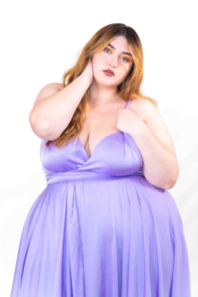
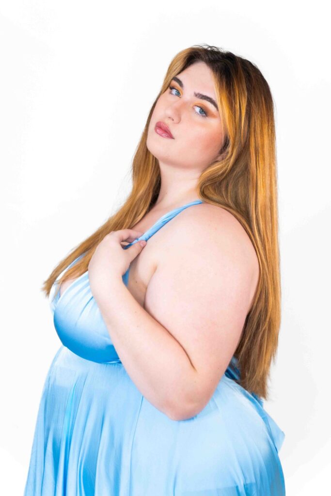
Your palette reflects that perfectly: dusty rose, lavender, powder blue, soft plum, muted berry, cool taupe. These shades work with the natural softness of your complexion, creating harmony rather than contrast.
What to avoid? Anything too warm, too orange, or too saturated, as these can make your skin look slightly off rather than radiant.
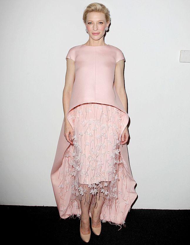
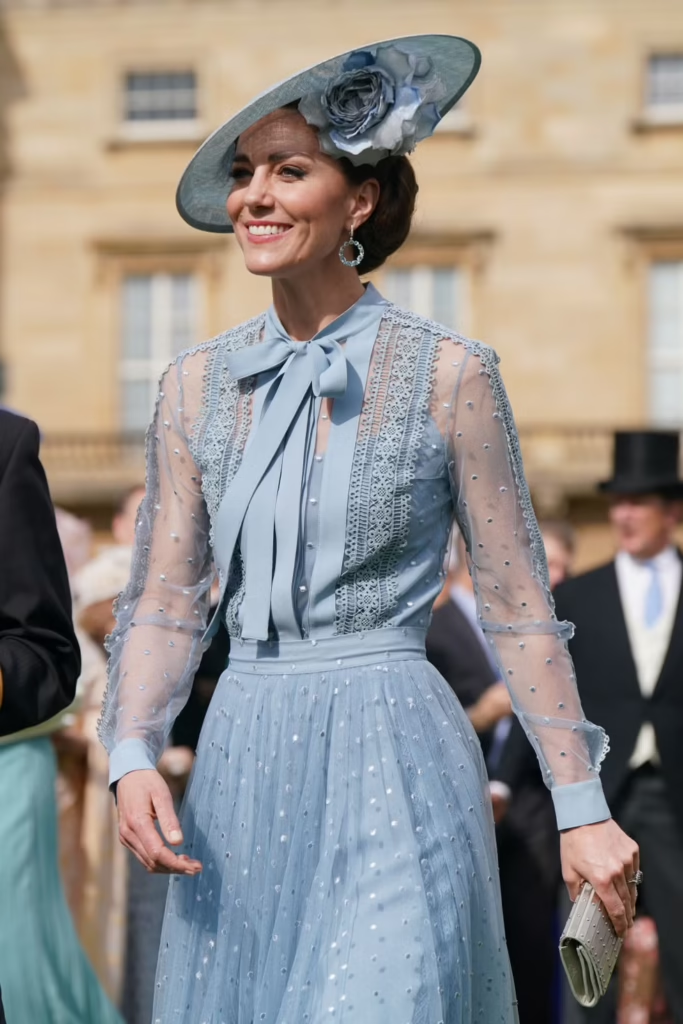
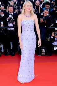
Kate Middleton, Cate Blanchett, and Naomi Watts are all frequently cited as Summer types, and if you look at the colors they wear when they look most luminous, soft and cool shades come up again and again.
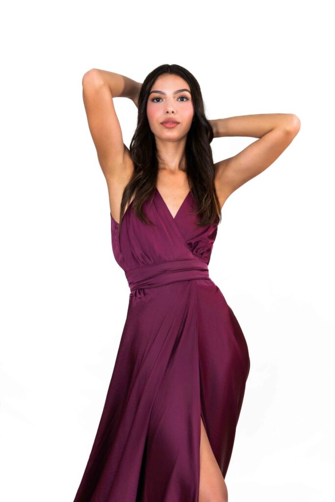
🍂 Autumn
Autumn types have some of the most stunning and distinctive coloring of all four seasons. If this is you, your skin has a warm, golden, bronze, or olive quality, you probably tan beautifully, and your hair is rich, whether that’s deep auburn, copper, warm brown, or dark with warm undertones. Your eyes tend toward brown, hazel, amber, or olive green.
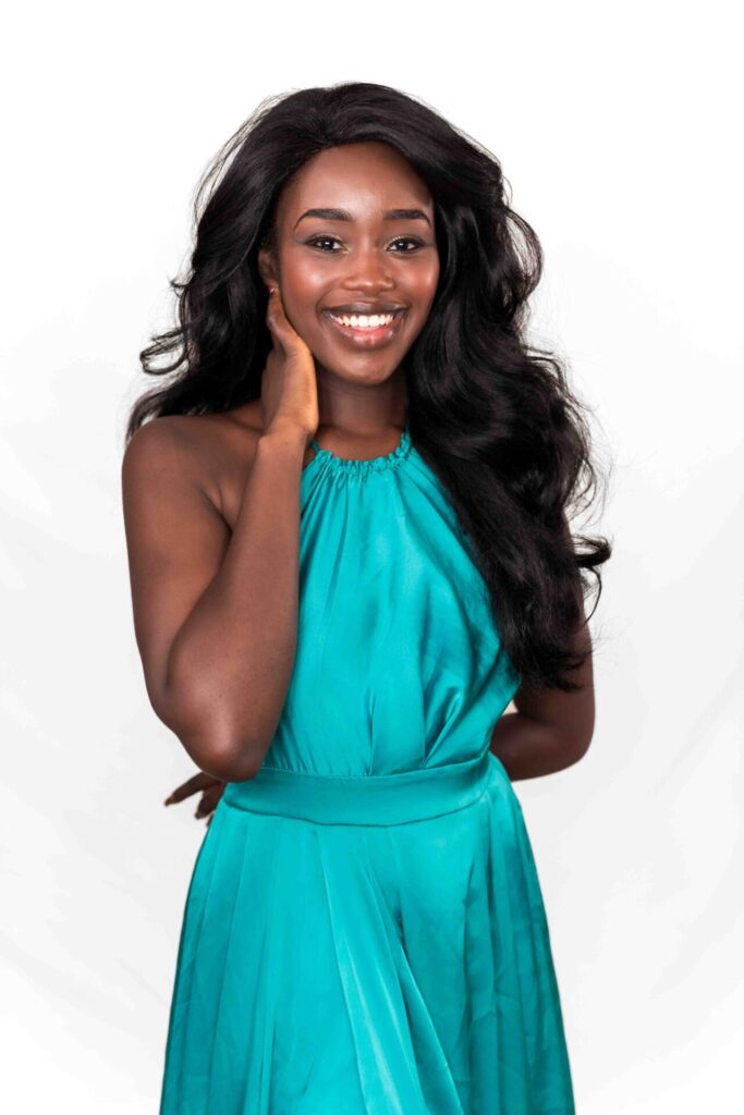
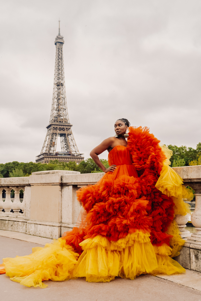
Your palette is rich and earthy: terracotta, burnt orange, olive, deep teal, warm burgundy, mustard, chocolate brown. These shades draw out the incredible depth and warmth in your coloring in a way that lighter or cooler tones simply cannot.
What to avoid? Anything too icy, too pastel, or too cool, as these tend to clash with your natural warmth rather than complement it.
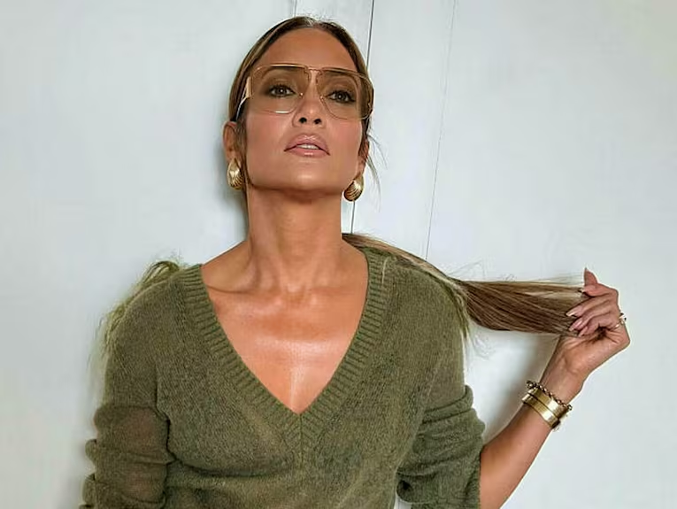
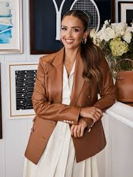
Jennifer Lopez, Julia Roberts, and Jessica Alba are all celebrated as Autumn types, which gives you a pretty good sense of the kind of richness and warmth this season carries at its best.

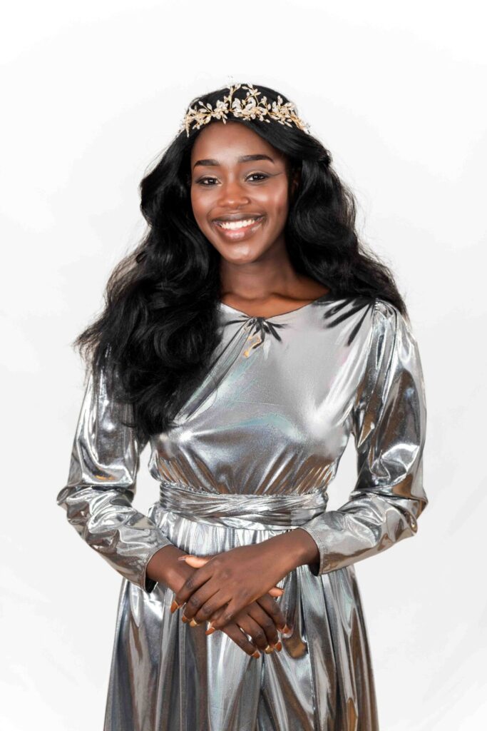
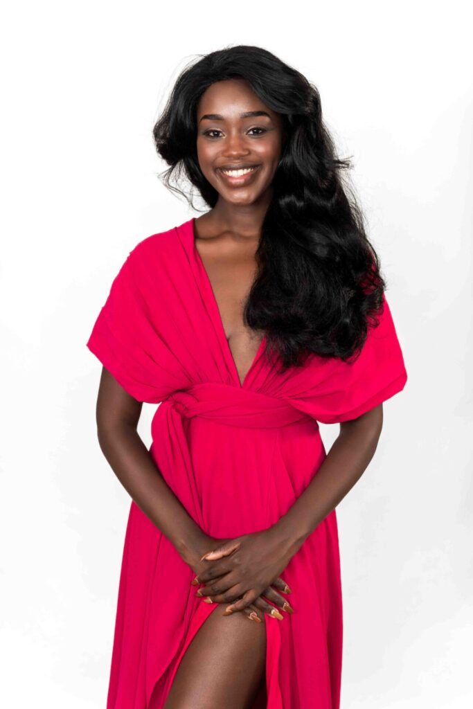
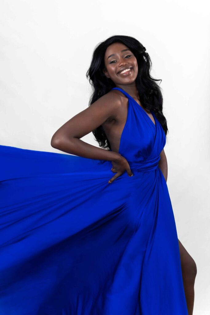
❄️ Winter
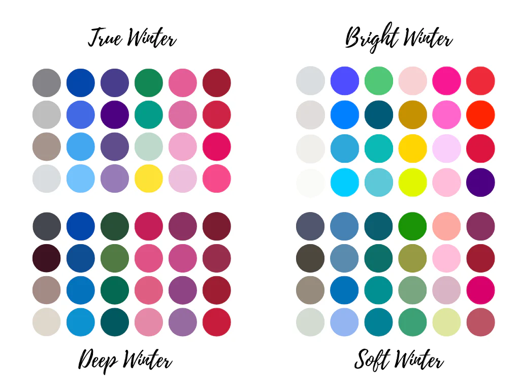
Winter is the most high-contrast of all four seasons, and if this is you, you know it. Your features are striking: skin that is either very fair or very deep, hair that is dark brown, black, or platinum, and eyes that command attention, whether they’re deep brown, cool grey, icy blue, or vivid green. There is nothing understated about a Winter complexion, and the right colors should match that energy.
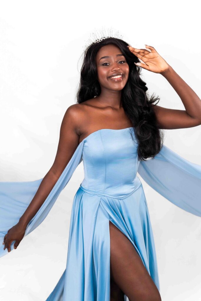
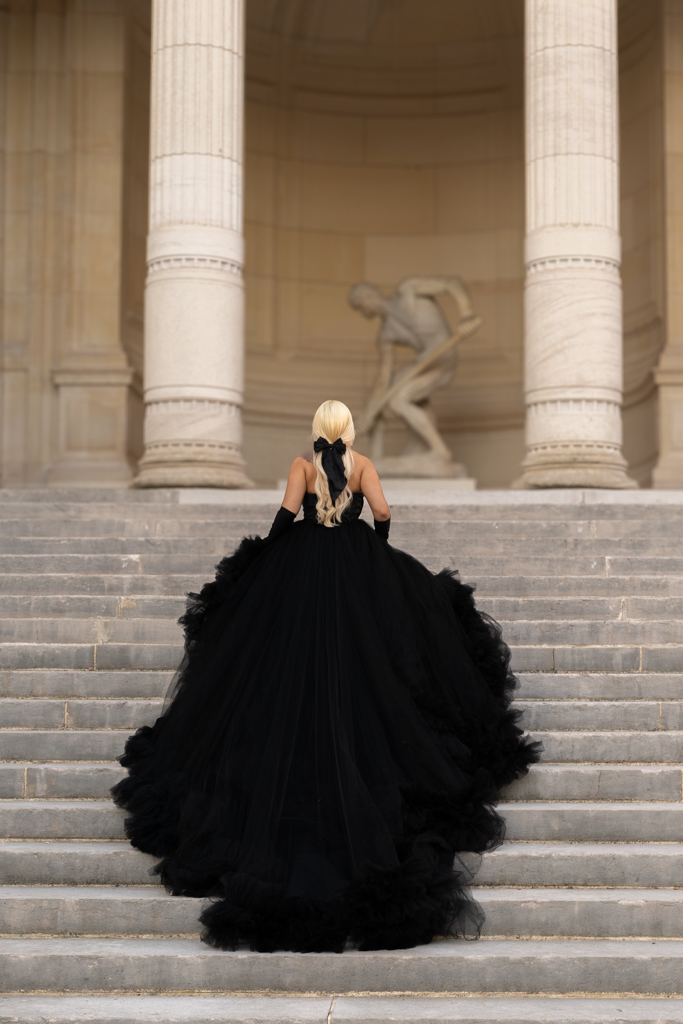
Your palette is bold and unapologetic: true red, royal blue, emerald, fuchsia, bright white, black, deep plum. You can carry shades that would overwhelm most other seasons, and you look your most powerful in colors that are clear, saturated, and cool.
What to avoid? Anything too warm, too earthy, or too muted, as these tend to make Winter types look tired rather than radiant.
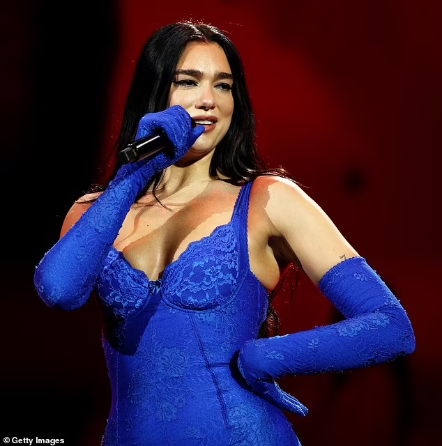
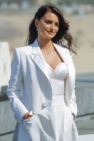
Dua Lipa, Anne Hathaway, and Penélope Cruz are all classic Winter examples, and the intensity of their best looks tells you everything you need to know about this season.
And if your season feels almost right, but not quite? ✨
Once you’ve found your season, you might discover that some shades within your palette feel more alive on you than others.
That’s completely normal, and it actually means you’re ready to go one level deeper.
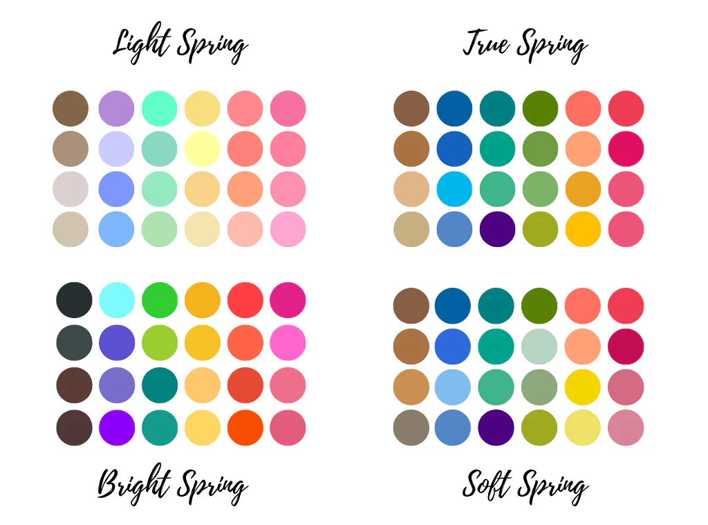
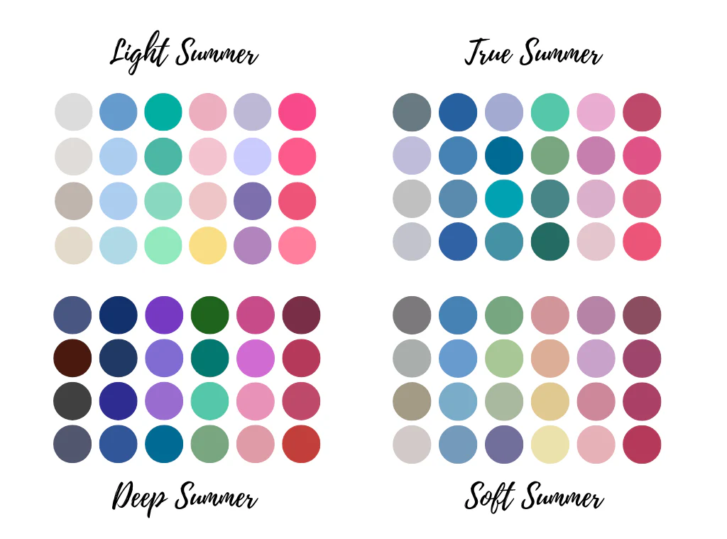
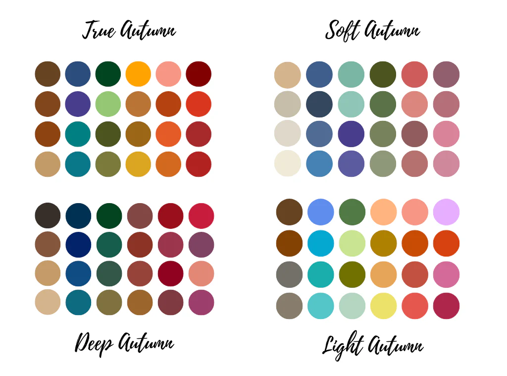
Each of the four seasons divides into three subcategories, creating what is known as the 12-season system.
🌸 Spring becomes Light Spring, Warm Spring, and Bright Spring.
☀️ Summer divides into Light Summer, Cool Summer, and Soft Summer.
🍂 Autumn breaks into Soft Autumn, Warm Autumn, and Deep Autumn.
❄️ And Winter splits into Deep Winter, Cool Winter, and Bright Winter.
If you feel like exploring your subcategory, a professional color analysis or one of the many detailed online resources dedicated to the 12-season system can help you get there.
How to Find Your Season, Starting With Your Undertone
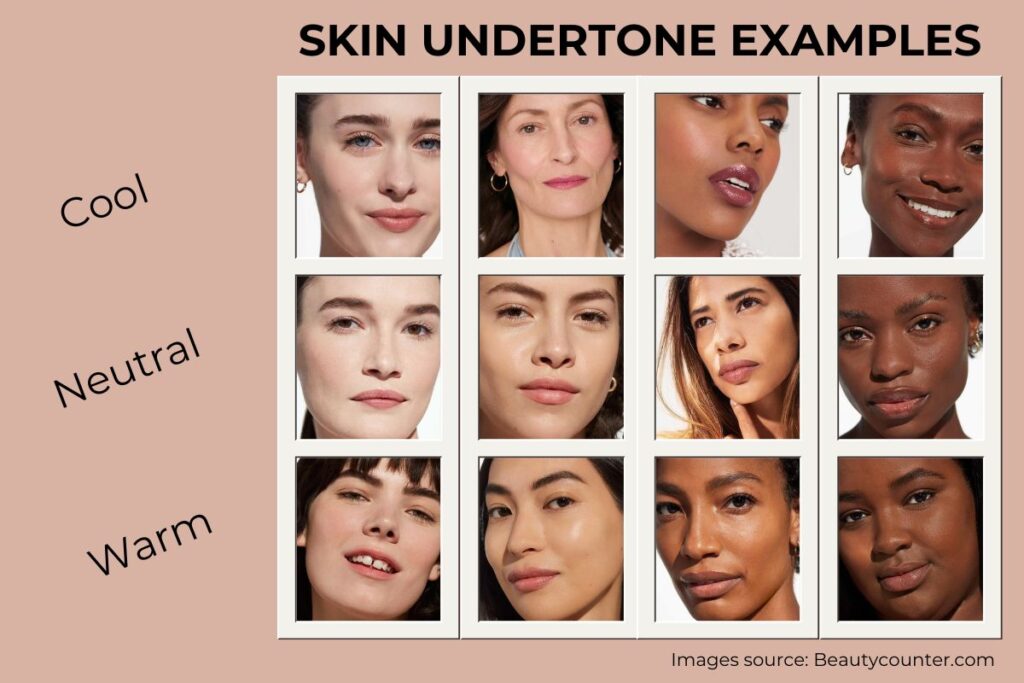
Before you can identify your season, there’s one thing you need to figure out first: your undertone.
Not your skin color, your undertone.
The two are very different, and confusing them is one of the most common mistakes people make when choosing colors. You can have deep skin with cool undertones, or fair skin with warm undertones. The surface color doesn’t tell the whole story. What matters is what’s underneath. ✨
Your undertone falls into one of three categories: warm (yellow, peachy, or golden), cool (pink, red, or bluish), or neutral (a balanced mix of both). Once you know this, your season begins to reveal itself.
Here are a few simple ways to figure it out at home :
The vein test. Look at the inside of your wrist in natural daylight, away from artificial lighting. If your veins appear greenish, you likely have warm undertones. If they look bluish or purple, your undertones are cool. If you genuinely cannot tell, and some people really can’t, you may be neutral.
The jewelry test. Think about whether gold or silver jewelry tends to make you look more alive. Gold flatters warm undertones, silver complements cool ones. If both work equally well on you, that’s a classic sign of neutral undertones.
The white paper test. Hold a plain white sheet of paper next to your bare face in natural light. Does your skin look more yellow or peachy next to the white? Warm undertones. More pink or rosy? Cool undertones. No visible shift? Probably neutral.
The sun test. Consider how your skin reacts to sun exposure. Warm undertones tend to tan easily and rarely burn. Cool undertones often burn first, then tan, or burn without tanning much at all.
Once you have your undertone, you can cross-reference it with your hair color and eye color to find your season.
A warm undertone puts you in the Spring or Autumn family.
A cool undertone points to Summer or Winter.
From there, the depth and intensity of your overall coloring, how light or dark, how muted or vivid, will guide you to your specific season and eventually your subcategory.
Not sure yet? There are tools that can help. 📱
If you find yourself stuck between two seasons, or if the tests above give you conflicting answers, you’re not alone. Color analysis can genuinely be tricky, especially for those with neutral undertones or features that don’t fit neatly into one palette.
A few AI-powered apps have become go-to references in the color analysis community.
Dressika lets you take a selfie and analyzes your skin tone, hair, and eyes against the full 12-season system, giving you your palette along with clothing, makeup, and hair color recommendations.
Colorwise.me uses a manual color selection method where you identify the dominant tones in your skin, hair, and eyes, which many people find more accurate since it reduces the impact of lighting on the analysis.
Vivaldi Color Lab offers a photo-based AI analysis with a digital draping feature that lets you visually compare how shades from different seasons look on you side by side.
Show My Colors takes a quiz-based approach, which works particularly well if you find photos difficult to interpret or if your coloring falls between two types.
Keep in mind that no app will give you a guaranteed definitive answer, especially if your coloring is subtle or complex. Use them as a starting point, run the analysis a few times in different lighting if needed, and look for the season that comes up most consistently.
For a truly personalized analysis, consider working with a color consultant.
Apps are a great way to get started, but if you want a result you can fully trust, a professional color analysis session is in a category of its own. A trained consultant will drape physical color swatches around your face in natural light, observe how each shade affects your complexion in real time, and give you a precise, personalized palette you can use for years.
And if you happen to be visiting Paris? You’re actually in one of the best cities in the world to do this. Paris has a long, deeply rooted tradition of personal style and color expertise, and the city is home to some exceptional color consultants.
If you’d like a recommendation for a session during your stay, just let us know. We’re happy to connect you with the right person.
Your Season, Your Dress
Now that you know your season, here comes the fun part. ✨
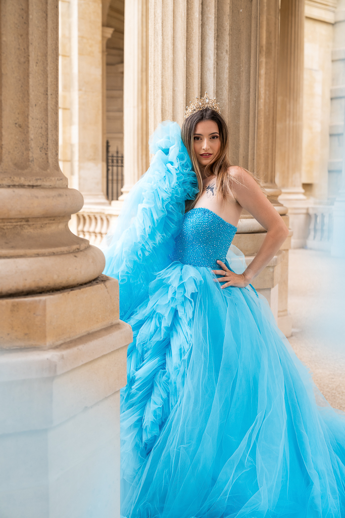
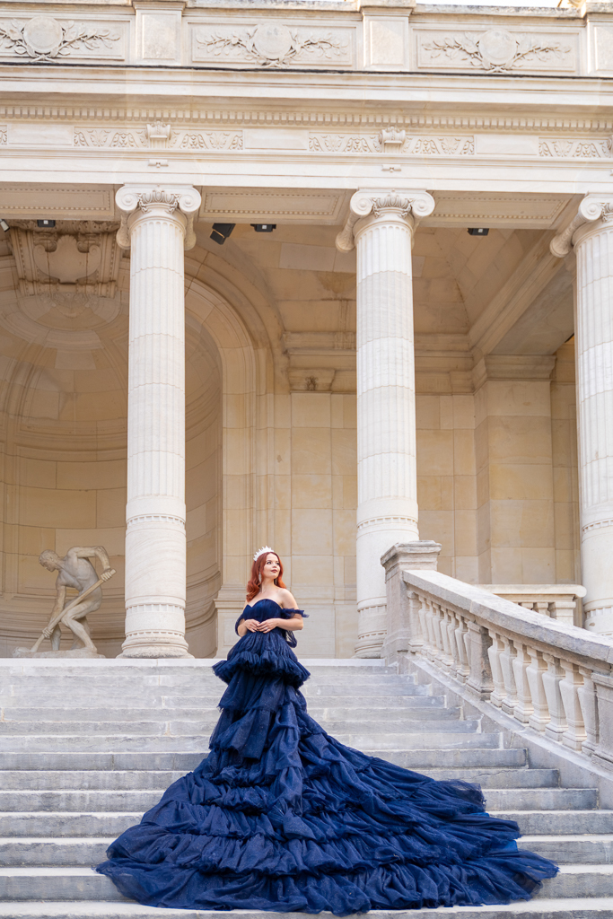
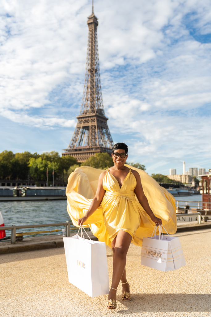
Our collection has over 150 dresses spanning Flying Dresses, Switch Dresses, and Luxury Dresses, so let’s make the choice easy.
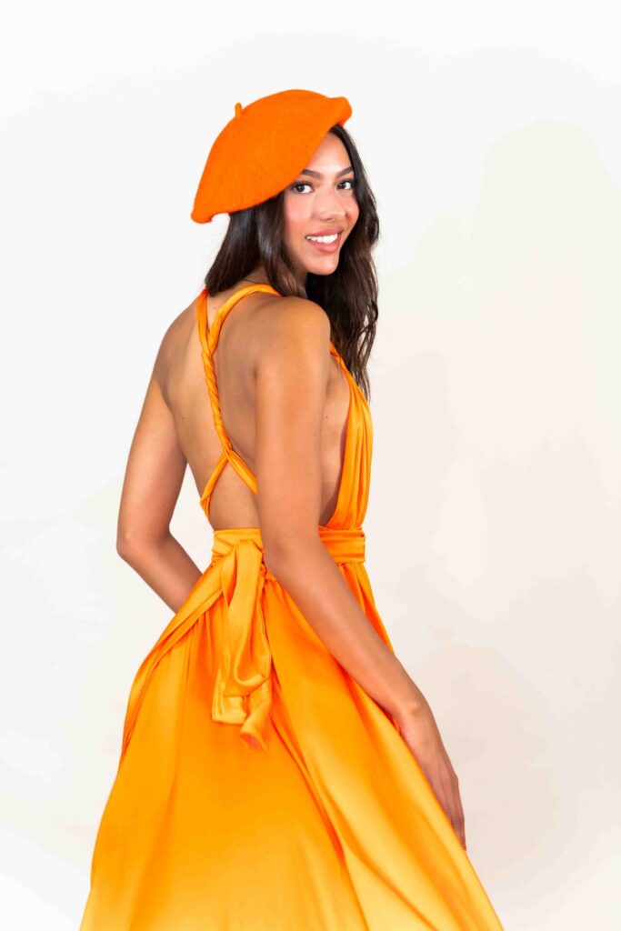
🌸 Dress Pick for Spring
You need warmth, brightness, and life.
Think coral, peach, golden yellow, warm orange, and vivid turquoise.
Your go-to Flying Dresses:
✅ Coral V Cleavage (F-25)
✅ Peach Transformer (F-33)
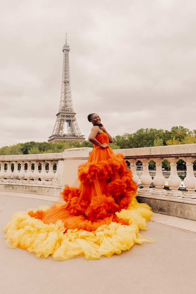
✅ Orange Classical (F-37)
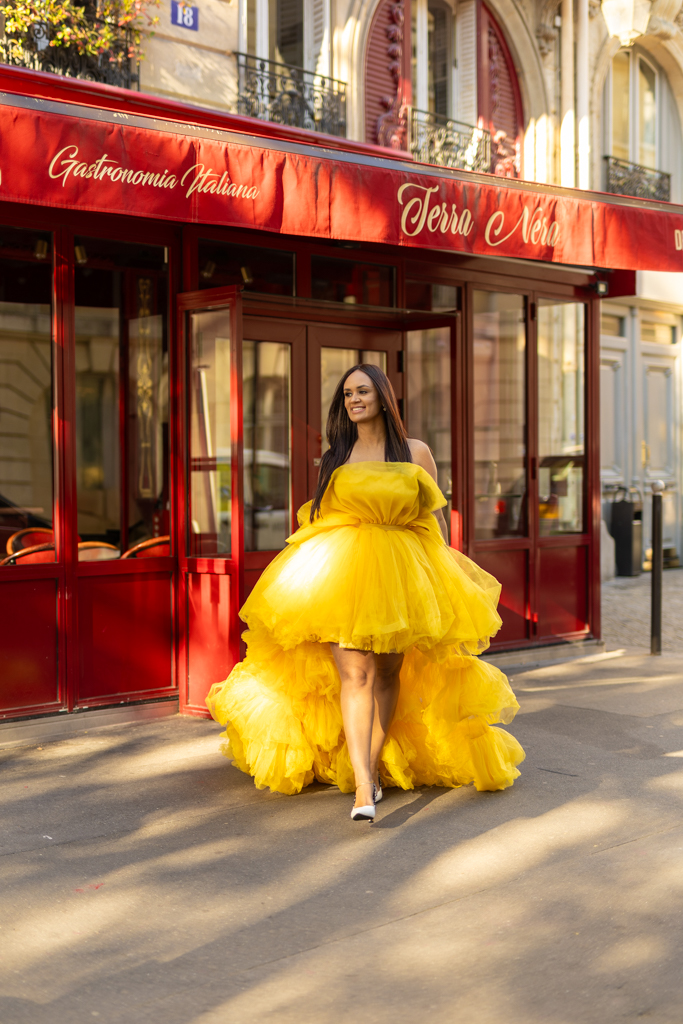
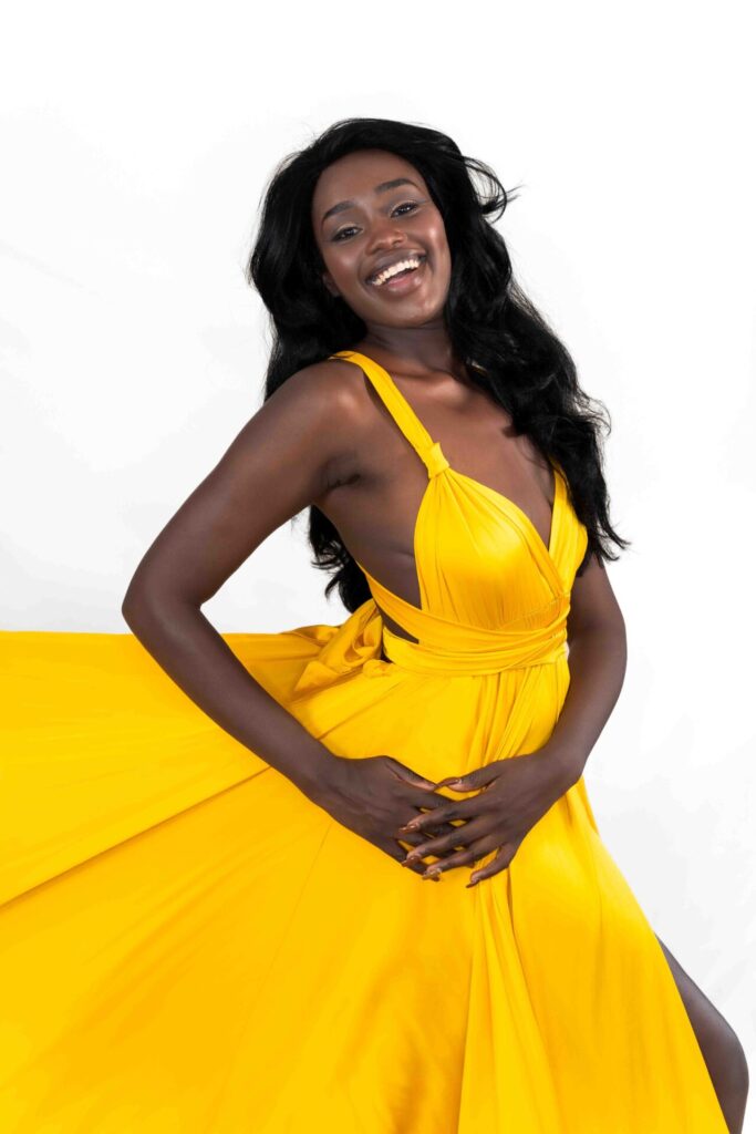
✅ Golden Yellow Classical (F-39)
✅ Turquoise American Collar (F-61)
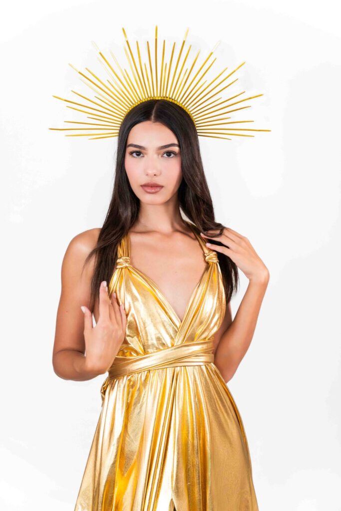
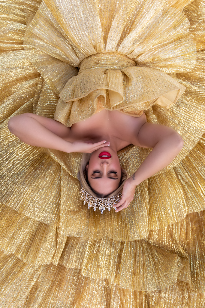
✅ The Gold Classical (F-103)
On the Luxury side, options that photograph beautifully on Spring types:
✅ Orange & Yellow (L-9)
✅ Yellow Switch Dress (S7)
✅ Blue Switch Dress (S-11)
✅ Pink Sparkly Luxury (L-4)
✅ Gold Luxury Dress (L-29)
❌ Avoid: icy pastels, cool mauves, lavender. They’ll look pretty on the hanger but flat on you.
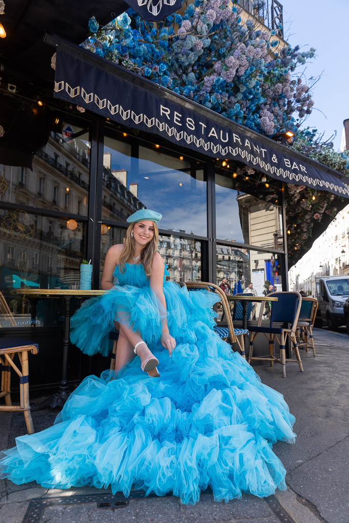
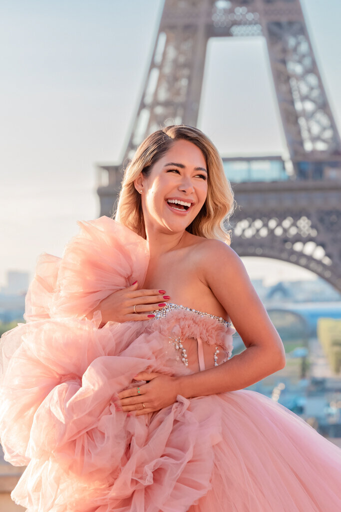
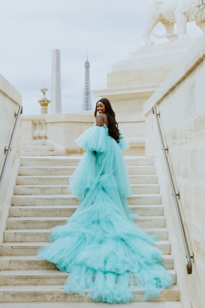
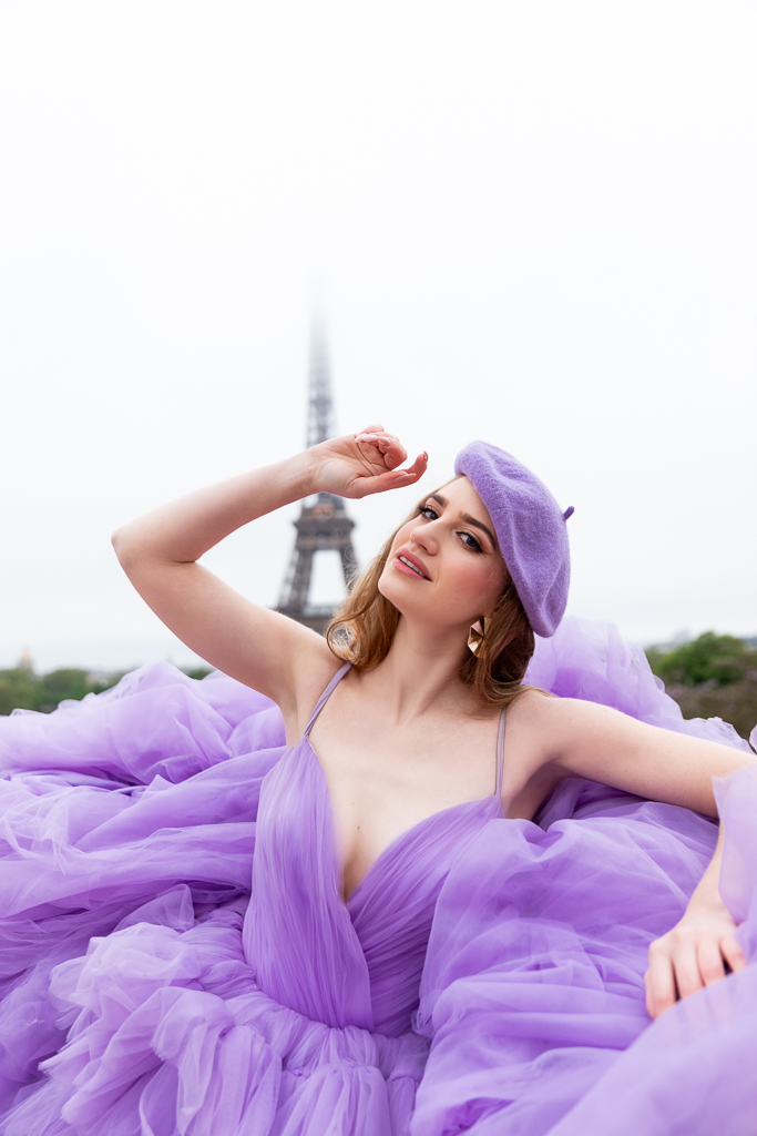
☀️ Dress Pick for Summer
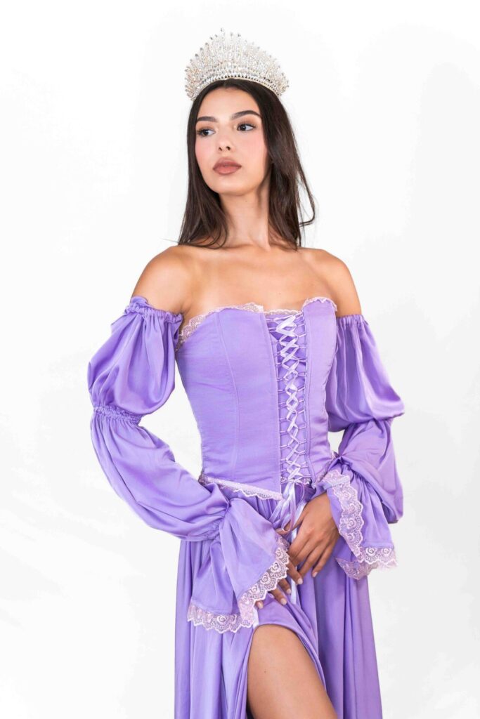
You need softness, coolness, and that effortless Parisian refinement. Think lavender, baby blue, blush, dusty pink, soft purple, and silver.
Your go-to Flying Dresses:
✅ Lavender Corset Top Raiponce (F-83)
✅ Lavender Classical (F-85)
✅ Baby Blue Corset Top Elsa (F-63)
✅ Baby Blue Classical (F-67)
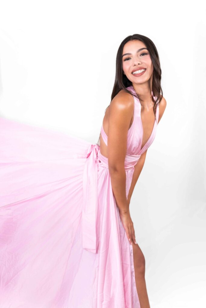
✅ Pale Pink Classical (F-29)
✅ Silver Covered Flying Dress (F-109) is a uniquely flattering metallic for you.
Luxury & Switch Options :
✅ Blush Pink (L-7)
✅ 3 in 1 Blush Ballerina (L-7B)
✅ Tiffany Blue (L-15B)
✅ 3 in 1 Baby Blue Cinderella (L-18)
✅ Purple (L-19)
✅ Midnight Blue (L-17)


❌ Avoid: warm oranges, gold metallics, anything too saturated or earthy. These create a visual clash with your undertones that shows up clearly on camera.
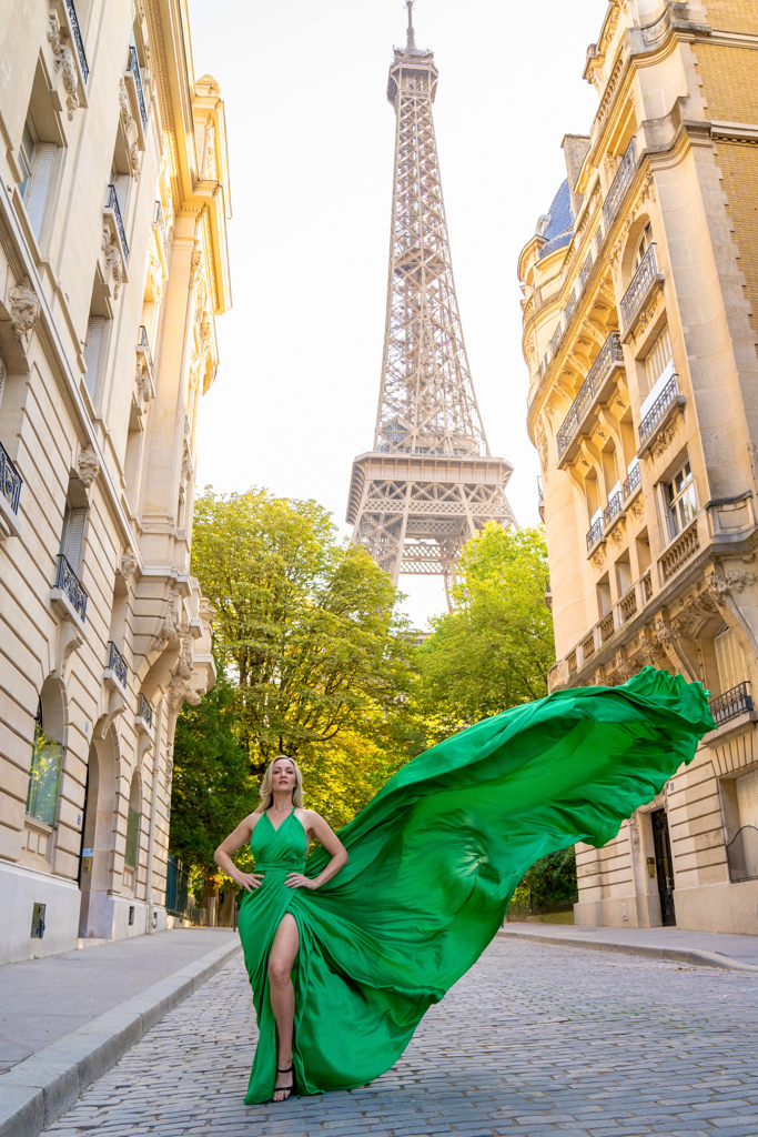
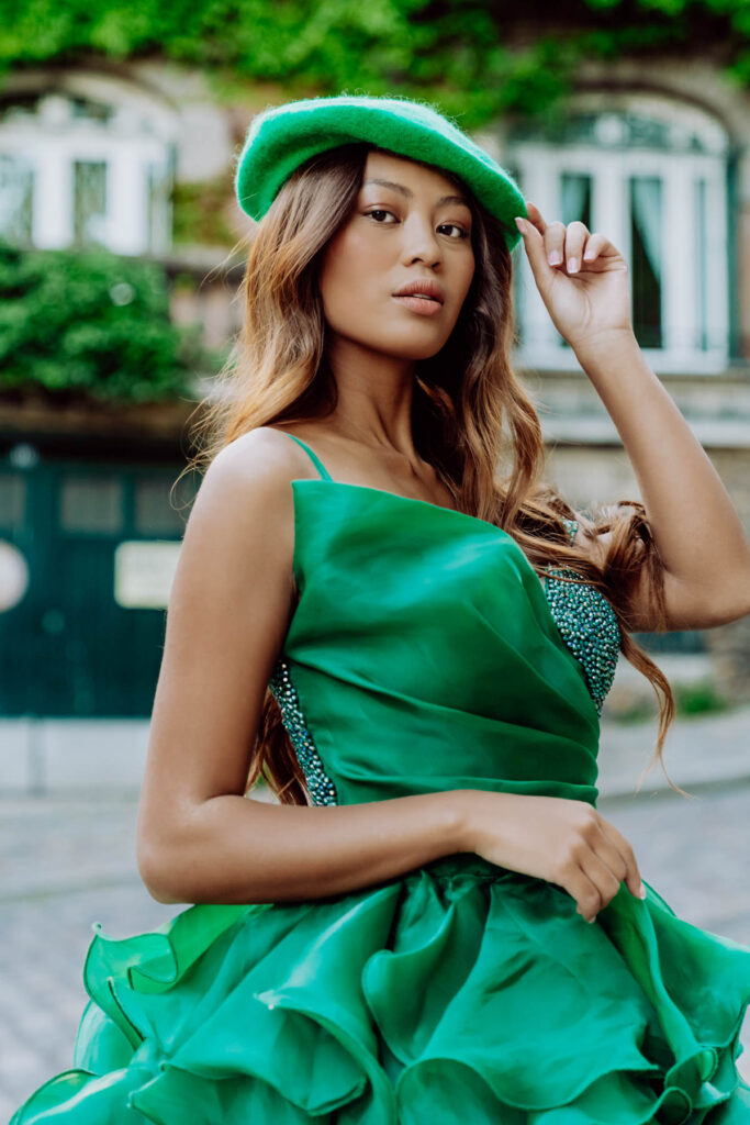
🍂 Dress Pick for Autumn
You need richness, warmth, and depth. Think deep teal, forest green, burnt orange, golden yellow, warm burgundy, and gold.
Your go-to Flying Dresses:
✅ Red Off Shoulder (F-9)
✅ Deep Red Classical (F-13)
✅ Green V Cleavage (F-51)
✅ Orange Classical (F-37)
✅ Golden Yellow Classical (F-39)
✅ Gold Classical (F-103)
On the Switch & Luxury side :
✅ Green (L-13)
✅ Yellow (S-7)
✅ Orange (S-5)
✅ Orange & Yellow (L-9)
✅ Black Luxury (L-27)
✅ Gold Luxury Dress (L-29)
❌ Avoid: icy blues, cool pinks, lavender, silver metallics. These fight against your natural warmth instead of enhancing it.
❄️ Dress Pick for Winter
You need clarity, contrast, and impact.
Think true red, royal blue, electric blue, fuchsia, white, black, and silver. Beyond red (more on that in the next section), here are six directions that are particularly powerful on you.
On the Flying Dress side :
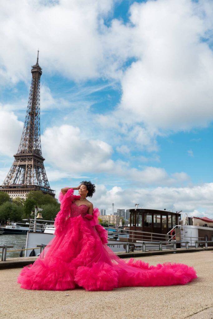
✅ Fushia Transformer (F-15)
✅ Indigo One Shoulder (F-79)
✅ Electric Blue (F-77)
✅ Dark Purple Classic (F-89)
✅ Black Classic (F-99)
✅ Silver Covered Flying Dress (F-109)
On the Luxury and Switch side:
✅ Fushia Luxury (L-4)
✅ Red & Pink Luxury (L-3)
✅ Purple & Blue Luxury (L-21)
✅ 3 in 1 Royal Blue Luxury (L-16)
✅ White Luxury (L-25)
✅ Black Luxury (L-27)

❌ Avoid: earthy tones, muted shades, gold metallics, anything too dusty or soft. These flatten your features rather than amplifying them.
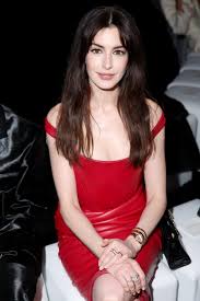
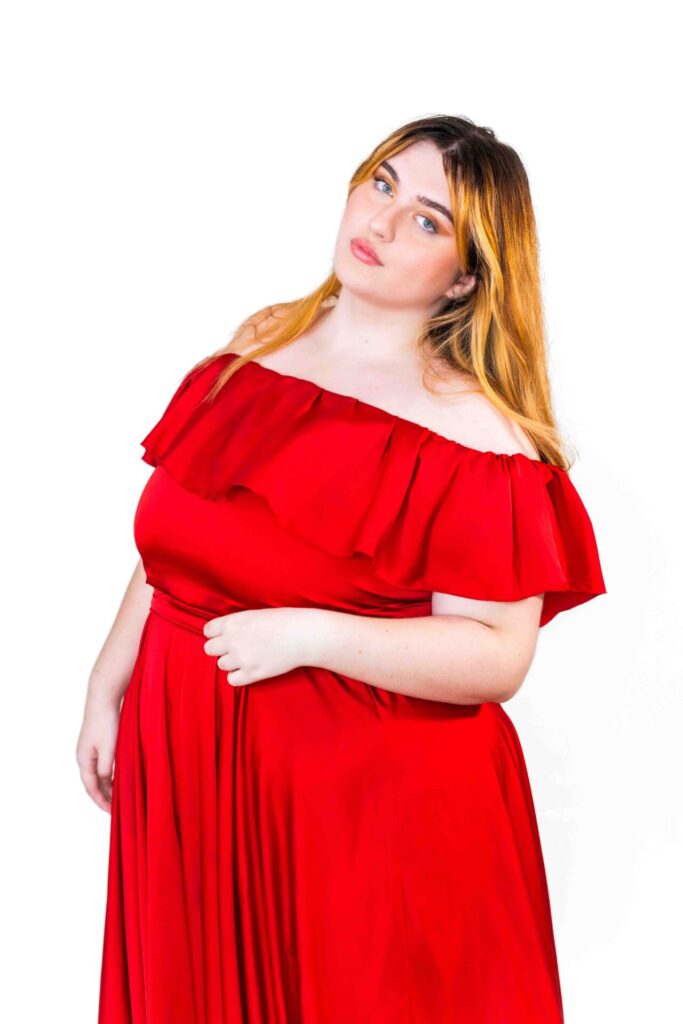
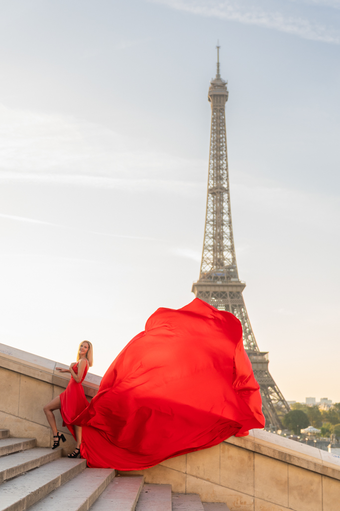
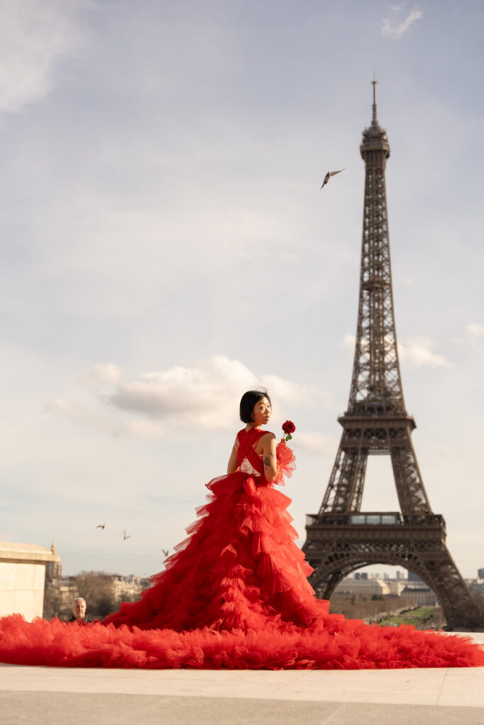
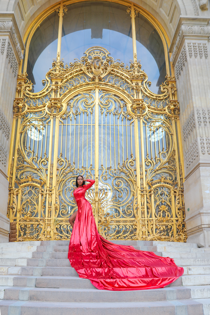
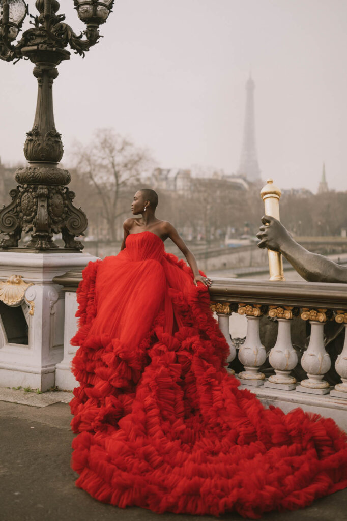
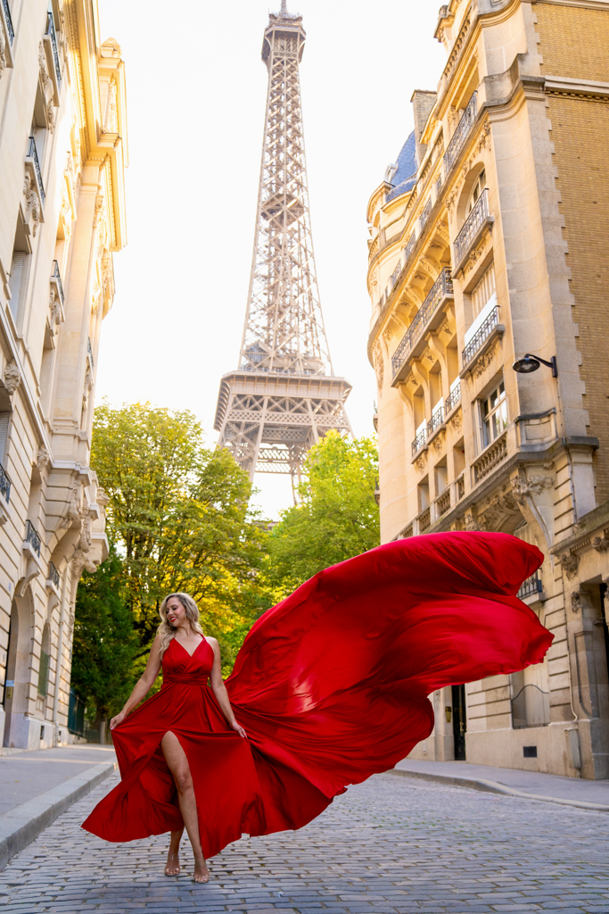
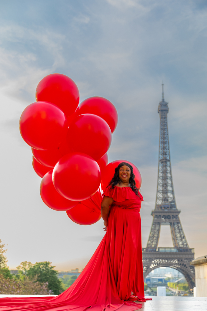
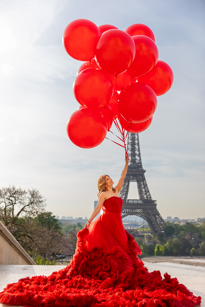
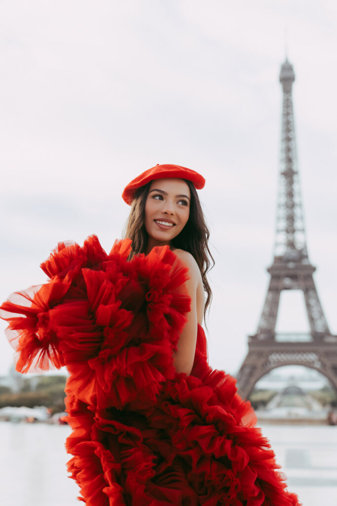
About Red. A Special Mention ❤️
If you’ve been scrolling through our collection and keep coming back to red, you’re not alone. Red is our single most requested color, across every season, every skin tone, every occasion. And there’s a reason for that.
Red is one of the rare colors that works on everyone, but not in the same way.
For Winter types, a true, clear red is one of the most powerful color matches that exists.
For Autumn types, a deep, warm red or burgundy draws out the richness of your coloring in a way that feels incredibly intentional.
For Spring types, a coral red or warm raspberry brings out the golden quality of your complexion.
And for Summer types, a cool-toned red or deep berry can be unexpectedly stunning, especially in the golden light of a Paris morning.
The key is not whether you can wear red. You can. The question is which red works best for you, and that’s where your season becomes a genuinely useful guide. Cool and clear for Winter, warm and rich for Autumn, bright and vivid for Spring, and muted or berry-toned for Summer.
If red is calling you, trust it. There’s a reason it’s been the most photographed dress in Paris for years. ✨

Still not sure? That’s completely okay. 💌
Color analysis is a tool, not a rule.
It gives you a starting point, a direction, a reason to feel confident in your choice rather than just hoping for the best. But at the end of the day, the dress you feel most excited about is almost always the one that will photograph best, because confidence translates on camera in a way that no color theory can fully capture.
If you’re still hesitating between two dresses, or if you’d simply love a second opinion, that’s exactly what we’re here for. When you reach out to book your session, just tell us a little about your skin tone, your hair, your eyes, and what you’re drawn to.
We’ll help you find the option that feels like you, from our full collection of Flying Dresses, Switch Dresses, and Luxury Dresses.
Everything can be tailored to your vision, and we can’t wait to create something beautiful with you in Paris. 🗼
Ready to explore the full collection? Our dresses are waiting for you here !


